Showing posts with label BRIEF 4 - Crossover Festival- DP. Show all posts

Tuesday, 29 May 2012

Brief 4 - Crossover -EVALUATION


Me and Jonny have been wanting to work together for a while now as we both share similar tastes in design as well as having similar practices. Our skill sets were similar but Jonny's ability to create a professional finished product with my strengths in concepts and branding worked together really well.

We found that we both had a go at everything and it wasn't really a matter of splitting up the jobs as we worked on everything together. We had regular meetings and schedueled time in for our project as well as booking in workshop sessions etc. We stuck to our plan really well and managed to produce a strong look very early on in the project as we wanted to submit it for the Yearbook... it definately gave us the push we needed to start the project and be pretty ruthless with our decisions. Me and Jonny worked so well together, it was great to bounce ideas off of each other as we both thought and could picture the project in similar ways.

Deciding what the event should be was probably the hardest part... starting with nothing we through some names / words back and forth before coming up with 'Crossover' we then took this forward and thought how this could relate to the festival and came up with the idea of 'Crossover' resembling Collaborations. Just like mine and Jonny's. The event was based on a mix of 20 creatives from all different aspects of creative disciplines forming 10 creative collaboration where they had the ability to cross their talent to produce new and exciting work.

Everything we created for this brief we took the word 'Crossover' in mind, whether it was the layout, format, how the exhibition space was branded etc was thought about in great detail. To keep the concept strong. Making up our own spot colour helped to secure it's own very memorable look and creating a logo that can be used in a variety of ways meant that the promotion doesn't all look the same. There is something engaging about each piece.

Again like my other briefs we used the workshops and facility A LOT, using a spot colour meant that everything had to be screenprinted then we used laser cutting etc to add another element to the brand.

The feedback we have got from students, tutors and whilst on studio visits has been amazing, it's so nice to think our hardwork has paid off and we feel so proud of our work. We have had comments such as 'The best brief all yr', 'One of our favourite projects', 'Really hit the nail on the head', 'So cool!' from students and studios, I can't wait to get it up onto my website :D.

I hope in a few years time when we're both settled in a job that we could actually get funding and make this festival happening because I think it's such a great idea and visually stands out from any other branding I've seen.

Monday, 28 May 2012

Photo's of Crossover project.


Me and Jonny wanted to make sure our photo's did our project justice so we used Kim's hot shoe flash which really brought out the best in the colours and detail of the project. Photographing on light grey as I felt my previous photo's on black darkened the whole project.

We took photo's of each seperate part of the promotion and how they worked together.

We're extremely happy with the quality of the photo's and compostitions.

Saturday, 19 May 2012

External promotion throughout the city

Using some of the photo's from Manchester city center I mocked up the promotion for in and around the city.

I did two variations of the main entrance into the Crossover exhibition. This is inside the Cornerhouse building. One with just the pattern and info and the other with the imagery aswell. these designs have been created based on the posters already.


The outer adverts of Cornerhouse where timetables and posters are placed to advertised, using two contrasting posters.


Outside Manchester Central map and directions board with poster to advertise... allowing people to connect.


Friday, 11 May 2012

Tickets

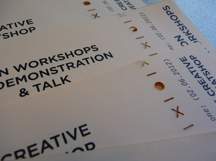
Me and Jonny had both made similar designs for the ticket, as I had worked on the wristband we took on Jonny's design as it looked more professional... we worked with an original ticket that I had for a gig so we could base it on a standard format adding our own branding with a perferated X / O pattern.

Printed tickets on salmon stock with laser cut perferation.


Friday, 4 May 2012

Posters to print

Using the work from the creatives chosen to make posters.... this is at digital print stage before the screenprinted pattern and logo is done. These will be on a mixture of white and salmon stock.

Using whole images, mixed and none.. with or without info.
Images are bitmap so they can be printed larger.

ALL GREYSCALE


Thursday, 12 April 2012

Jonny's book mock-up

Based on my initial layout ideas me and Jonny worked on the format of the book.

Using a mix of white / salmon pages. 
Images on salmon and content on white.

Using the tracing paper divide between each collaboration info / work so it physically crosses over. and working out where the mini book could go.


My design for split tracing paper pages using Gotham font ...


Wednesday, 11 April 2012

Collecting Content

Me and Jonny spent a full day organising the content for the festival. We wanted to show how it could be a real event so tried to design everything and organiser all aspects.

We want 10 collaborations formed from a mix of 20 creatives covering all disciplines. Using Behance we searched for different creatives covering all aspects from sculpture to digital art, product design, photography etc. All of the creatives chosen were from Europe as it is a European festival so we also chose artists to reflect a variation of all areas throughout Europe.


We have been using DROP BOX to share our designs and research. It's been a great way to work on the project while were not at uni.

Along with the artists we collected numerous images from each artist to use.

Here is our final list:

Adrien Coroller — Auxonne, France — Sculpture

Alberto Seveso — Portoscuso, Italy — Digital Art

Atelier Olschinsky — Vienna, Austria — Illustration/Typography
 
Christopher Jonassen — Stavanger, Norway — Photography
 
DUA Studio — Frankfurt, Germany — Product Design
 
Hekki Leis — Tallin, Estonia — Art Direction
 
Illa Guilla Persson — Gothenberg, Sweden — Photography
 
Kattaca — Madrid, Spain — Fashion
 
Le Creative Sweatshop — Paris, France — Art Direction
 
Levi Van Veluw — Arnhem, Netherlands — Sculpture
 
Lolo & Sosaku — Bilbao, Spain — Audiovisual
 
Matthias Heiderich — Berlin, Germany — Photography
 
Navier Romain — Nantes, France — Motion Graphics
 
Neon Workshop — Wakefield, UK — Industrial Design
 
Raw Color — Eindhoven, Netherlands — Graphic Design
 
Rusian Khasanov — St. Petersburg, Russia — Typography
 
Svilen Gamalov — Varna, Bulgaria — Furniture
 
Valistika Studio — Barcelona, Spain — Illustration
 
Zim & Zou — Nancy, France — Craft
 
Zoran Sunjic — Industrial Design — Split, Croatia

Screenprinting Posters

First set of posters.

Using X / O pattern... masking off sections to develop slightly different series of posters.


Friday, 6 April 2012

Typefaces used

Jonny introduced be to the Gotham Font it works really well to achieve a European look and has a circular 'O' which we wanted for the logo.

Jonny used a serif font for the secondary typeface although I suggested we used something that looked more contemporary and European.

Gotham & Letter Gothic STD work nicely together and I proposed this in my ealier layout design ideas.