(sorry for the terrible drawing skills!) Just a general gist.
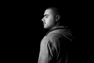
We met Stuart Leckenby today which is the photographer we have got for the yearbook, it was really exciting to throw discuss our ideas with him and see the finished results. I thought I'd be fine having my photo taken but stress isn't doing my skin any favours right now and I was worried they'd be picked up on the camera.... it was great to see what clever lighting composition and a little re-touching could do. I know other people would have similar worries so this is something I would explain when pitching the idea to the students. We need people to realise that they can have any composition they feel most comfortable with because of this we took a variation of shots to show people they can photograph as little or much as possible of themselves and show how they could work with things they feel confident with. Before we met Stuart we had seen a lot of his work on the internet and I felt strongly towards the high key shots (white background) although after playing around with both low and high key swell as different lighting techniques it was interesting to see that people could have the option of choosing between these depending which look they preferred. As Fred and Lorenzo said, we don't want each page to look the same so it would be a lot more interesting and also make people look more individual by allowing them choice to select a shot they would like.
Anyway here's a few shots below, before and after retouching.
Brian did the selection and retouching
Here's a selection of photographs to show proposals for shots.
All Rights to Photography are that of Stuart Leckenby


No comments:
Post a Comment