
Out with the new and in with the old
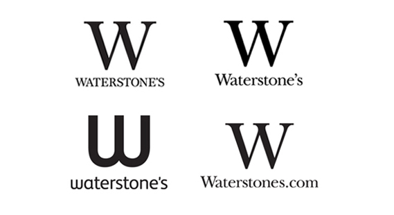
Waterstones' identity has moved from Baskerville in full caps, to regular type (top row); to FS Albert Pro in 2010 (bottom left); and now, back to Baskerville, but without an apostrophe (bottom right)
In its second rebrand in as many years, Waterstones has ditched its 2010 identity, reverted back to Baskerville type and dropped an apostrophe. Frivolous? Well, with apparently only a handful of some 275 stores to change back to the old identity, the move is effectively bringing the previous rebrand to a halt. And that might be cheaper...
Back in May 2010, Waterstones' then parent company, HMV, asked their preferred branding consultants venturethree to design a new identity for the booksellers. The agency came up with the sans serif 'w', shown above, combining that with a lowercase treatment of the name set in FS Albert Pro.
While the new identity was trumpeted by Waterstones as a reflection of its move into online, it only appeared on a handful of physical shops. Often it was used on in-store display material while the exterior shop signage was left in the old style (as on the Oxford Street branch near the CR offices). Despite venturethree's efforts to create a 'flexible' identity system, the occurence of both treatments in the same shop just looked messy.
In effect Waterstones' new MD James Daunt is putting a stop to that. He claims that the brand is now "deserving of a capital 'W' and a font that reflects authority and confidence." As regards the removal of the apostrophe he says that "in a digital world of urls and email addresses [it offers] a more versatile and practical spelling."
So essentially Waterstones is canning a rebrand that has taken nearly two years to roll out across a handful of stores. But it has dressed this up as a return to a "much loved" high street identity. While there's something to be said for cutting your losses – and, personally, I prefer the classic Waterstones branding – the move seems more like a debrand than a rebrand. But Waterstones can hardly be accused of inviting the usual "how much did that cost" invective, so perhaps the move is something to applaud?
Yet the reasoning behind taking out the apostrophe still grates with me. Surely most internet users already know they don't feature in web and email addresses, even if the company name requires one? Lowercase type used to be the default for brands who wanted to say 'we're online', but claiming to be more in tune with the digital world is a poor excuse for removing an element of punctuation that is already under threat.
Save the apostrophe! The campaign starts here.
No comments:
Post a Comment